Safe As Milk mega menu: Your shortcut to a world-class navigation
With teams of specialists and developers, along with data experts to track every detail and action, the big e-commerce names out there have turned online store navigation into a finely tuned science.
Sounds a little over the top? Let me assure you that the effort is justified, in fact, a correctly optimized navigation can boost conversion rates by a massive 18.5%.
But without expertise or a large budget to invest in optimizing your navigation, it sounds like your only option is to get your lab coat on and start experimenting in the hope that you’re lucky enough to stumble upon the perfect navigation.
Unless of course…there is some clever shortcut?
With the release of the new Safe As Milk mega menu now available on Venue and Creative, I’m pleased to say there is.
Safe As Milk mega menus bring insanely flexible navigation options to your business allowing you to replicate the navigation structure of the giants of the industry while incorporating your own unique twists.
Now you can simply pick out what you like from many of the world’s leading brands and put it into action on your own store.
By taking this shortcut, you can implement a navigation system that has been thoroughly researched, tested and proven by experts and begin to reap the rewards.
And here's the best part – you won't need a team of specialists or developers. Everything you see today can be accomplished by using the Safe As Milk mega menu, available on Shopify premium themes, Venue and Creative.
With that, the challenge is set, let's take a look at some real-life examples of the world’s biggest e-commerce stores and put Venue to the test!
Contents:
This blog will look at some of the world’s most successful e-commerce stores, we will then replicate what they have done as closely as possible, using only the Safe As Milk Mega Navigation feature.
Here are the brands:
Near the end, we’ll go over how this extends into mobile and share the exact settings used to create the replicas, letting you recreate them on your own store in as little time as possible, this is a shortcut after all ;)
Nike
Collage of Nike sponsored athletes
Nike has been doing things right since it began in 1964, it is at the point now where the brand is basically synonymous with sport.
They have involved everyone in their brand, from world-class athletes to people picking out their first pair of running shoes.
This makes for a challenge when it comes to setting up navigation, as each visitor is looking for something unique to them from the website.
With that, Nike has built navigation that leaves out nobody, they have clearly grouped the available options to make it simple for every type of customer to find the products that apply to them and styled them in easy-to-ready lists - so even though there is a massive amount of options, finding the one that applies to you is a breeze.
If you’ve got an apparel store or if you serve a diverse group of customers with a large catalog of products, this could be the fit for you.
Check out the videos of Nike and the Safe As Milk mega menu replica below :
Nike.com mega-menu navigation
Safe As Milk mega-menu navigation
Allbirds
A blazing example of a Shopify success story, the team at Allbirds brought this sustainable sneaker brand from first sale all the way up to a billion-dollar valuation using the Shopify platform – the crazy thing is, they did this inside two years!
Results like this don’t happen by accident, Allbirds put on a masterclass of getting the important things right, with one of those being their mega menu design.
Allbirds offers a clean design that incorporates some clever subtle promotional images.
This makes it a manageable intuitive journey for their customers helping them to find what they want quickly while also lightly nudging them to discover other products that are on offer and increase brand awareness.
Being such a new and popular company, getting the navigation just right certainly helped with turning interested visitors into customers.
If you have a unique product offering and getting a lot of traffic off the back of that, pull some inspiration from the All-Birds menu and watch as that traffic turns to sales.
Let’s check it out:
Allbirds mega-menu navigation
Safe As Milk mega-menu navigation
Kylie Cosmetics
Kylie Cosmetics founder and influencer Kylie Jenner
The Kylie Jenner brand redefined what is possible when it comes to the power of influencer marketing and opened the door for other huge names to break into the world of e-commerce in ways never seen before.
Another homegrown Shopify success story, Kylie Jenner is undoubtedly redefining how business is done online, through the power of influencer marketing.
With a well-planned and optimized e-commerce campaign using Shopify, Kylie Jenner has turned her loyal Instagram fan base into a loyal customer base, a remarkable accomplishment, worthy of a cover page on Forbes magazine.
The Kylie Cosmetics website caters directly to her customer base most of whom are coming from Instagram, this is done with an image-heavy, visually striking design, and it could be argued that the mega-menu layout serves as its centerpiece.
The mega-menu is full of eye-catching images while also flowing extremely well, giving customers a similar experience to what they are used to on mobile apps such as Instagram.
If you are an influencer or planning on leveraging influencer marketing into your business plan, then this is the holy grail navigation to implement on your store.
Let’s check it out:
Kylie Cosmetics mega-menu navigation
Safe As Milk mega-menu navigation
Tecovas
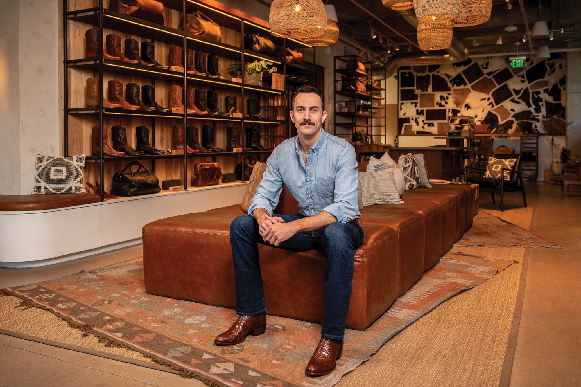
Tecovas founder and Executive Chairman Paul Hendrik
Established in 2015, cowboy boot brand Tecovas set out to disrupt the billion-dollar Western lifestyle industry with an online direct-to-consumer service, that was accessible to all Americans, whether you’re a born and bred Tennessee rancher or a Hawaiian A-List movie star.
As a debut brand, sending out an invitation for all of America to embrace a style steeped in tradition and usually reserved for those from specific states was a gamble… they ran the risk of being embraced by neither customer base.
However, the gamble paid off big time and was reflected in a $200M gross sales projection in 2022.
Tecovas pulled this off with an expertly balanced approach of building a brand with enough twists to attract a new customer base while also making sure the original boot lovers could relate to what they were doing and felt that their traditions and values were reflected in the brand.
Their navigation setup is a shining example of this balance.
The use of images in the menu helps to give visual cues to customers new to the industry, helping them to go from newbies to pros when it comes to knowing what Western fashion has to offer them.
The same images help to strengthen ties with lifelong cowboy boot aficionados, making sure they can relate to the brand and see their values reflected in it.
In a stroke of genius, Tecovas also structured their menu in a way that left room to grow.
Off the back of the success of their boots, they expanded into accessories, which now account for a massive 20% of their overall sales.
This new range was cleverly integrated into their navigation in a way that feels natural and blends in nicely with the customer experience.
If like Tecovas founder Paul Hendrik, you have a plan to bring a product historically reserved for the few to the masses and with an eye for further expansion, this could be the world-class navigation for you.
Let’s check out their mega-menu and the Safe As Milk mega menu version below:
Tecovas mega-menu navigation
Safe As Milk mega-menu navigation
Powerful mobile menus
A common pitfall across online stores is mobile navigation, with small screen sizes and an even smaller area to try and wedge in an intuitive menu for your thumb-scrolling customers, it’s a tricky thing to get right.
Most online stores settle for a “usable” mobile menu rather than one that creates a flowing, intuitive shopping experience for their customers.
With the Safe As Milk mega menu in play, mobile customers are never an afterthought.
This menu leaves nothing behind when it comes to the mobile version of your menu, instead of cutting our important elements like branding images, it cleverly integrates your entire menu structure into a clean and uncluttered drawer design.
Extra buttons can also be added to make sure your customers can get where they want to go without any of the usual thumb gymnastics. This means the top level navigation options don’t need to double as impossible-to-click links and your customer will be able to flow through the menu without any frustrating miss-clicks.
Check it out below:
Venue mobile mega menu demo
However, sometimes integrating the desktop menu alone is not enough, so the Safe As Milk mega menu gives you the option to use an alternate menu that is for your mobile customers’ eyes only, this gives you the power to fully optimize your menu to work for small screen shoppers.
Another common issue is that important information can get lost on mobile or hidden behind a wall of clicks - many times this information is the difference between a sale being made or not, think shipping times or a returns policy.
This is where Venue secondary menu feature comes into play, displayed on the first level of the mobile drawer the information your customers need to feel comfortable making a purchase will never be far out of sight.
To make sure your customers have the best experience possible, the mobile drawer can also display your contact details, social media icons, customer account login along with a currency converter.
Safe As Milk mega menu’s feature rich mobile drawer
Final notes
Taking inspiration from these types of A-grade stores is a wonderful way to enhance your own store and through challenging the Safe As Milk mega menu to recreate them, it is clear that hiring a team of specialists is no longer needed in order to act upon that inspiration.
Having the functionality to closely replicate world-class mega-menus is an extremely powerful and potentially lucrative addition to your toolbox, however, don’t forget to integrate your own unique style with the many combinations and flexibility that both Venue and Creative provide.
A mega menu foundation inspired by experts combined with your business’s own unique style and branding is the true key to a world-class navigation setup.
See a menu that you’d like to try? Scroll down to the bottom for all settings galleries.
Ready to start growing your business?
Install an unlimited free trial of Venue or Creative today.
Setting Galleries
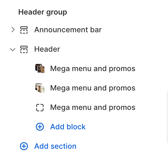
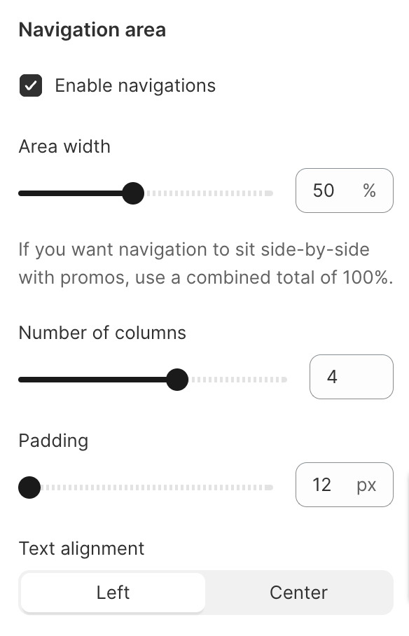
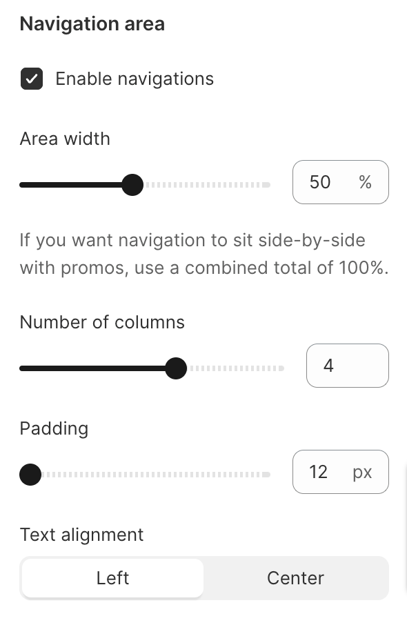
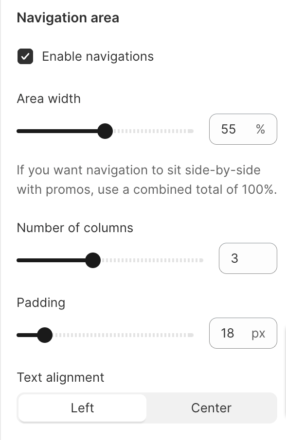
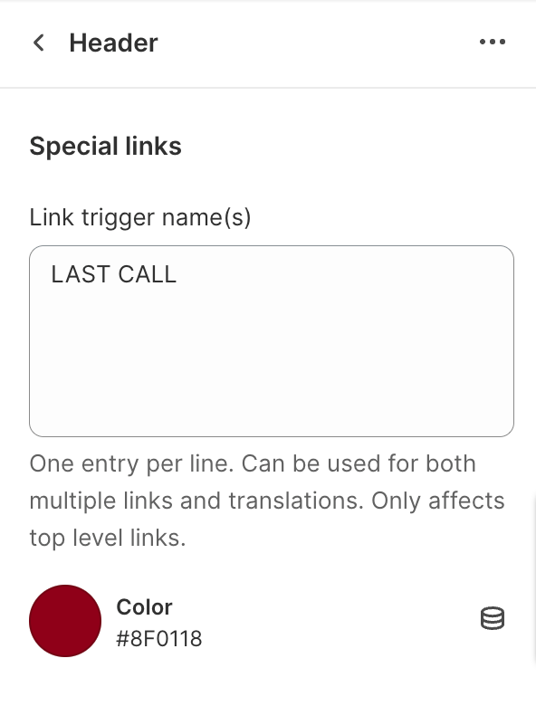
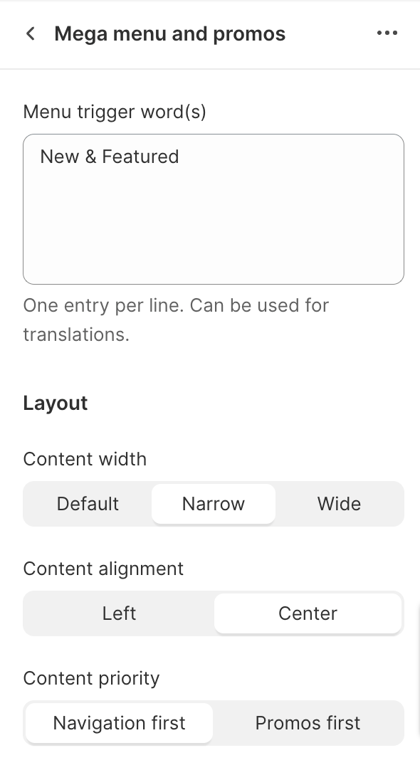
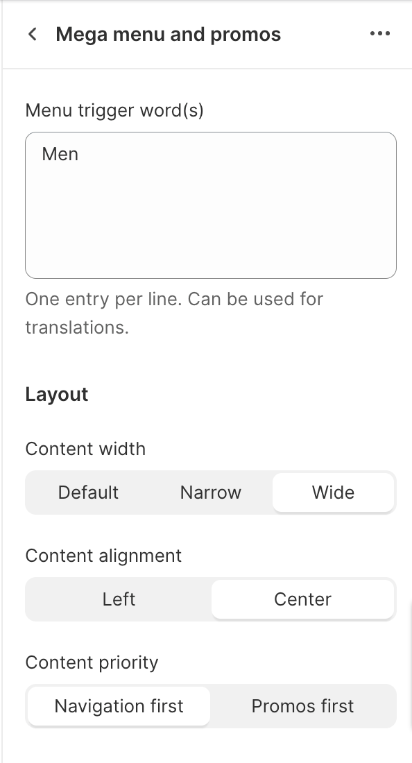
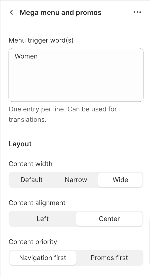
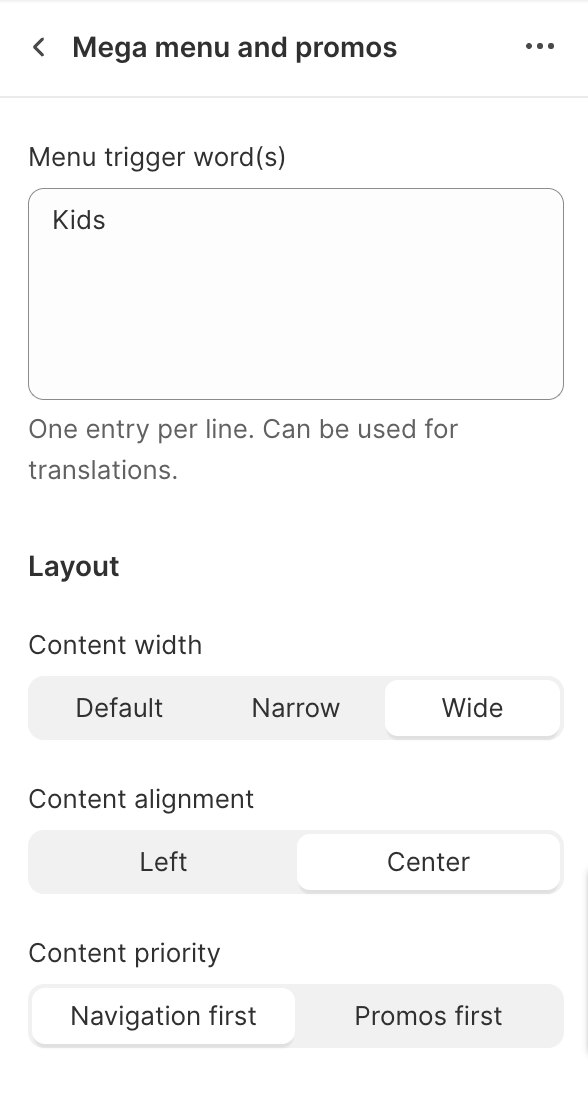
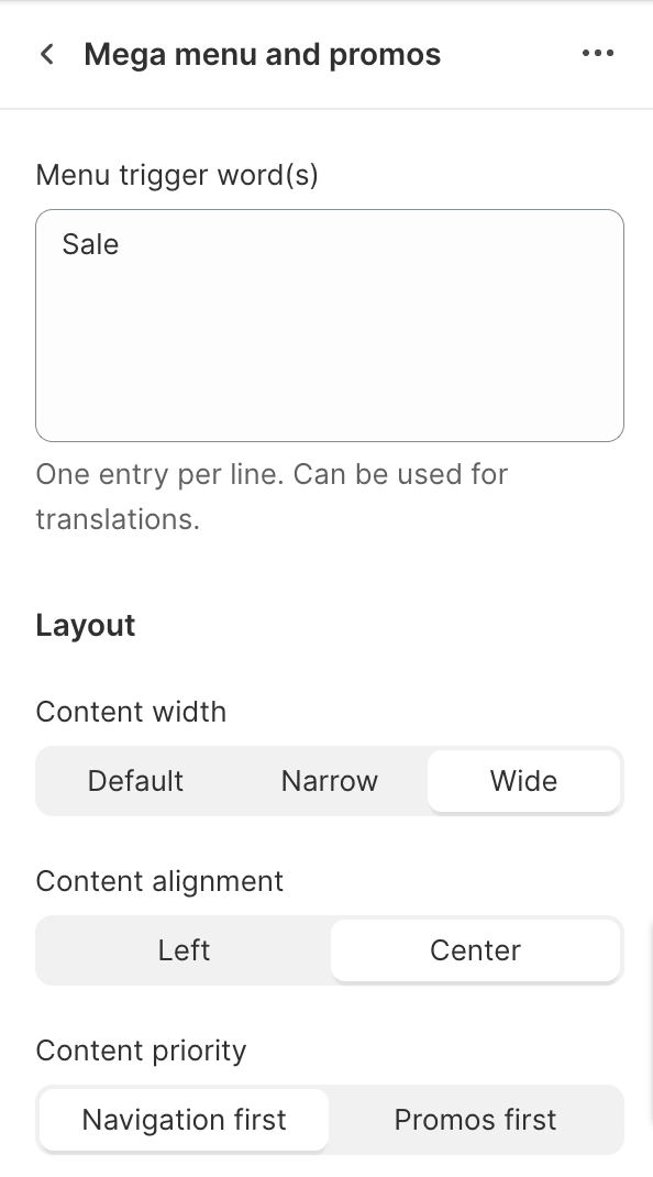
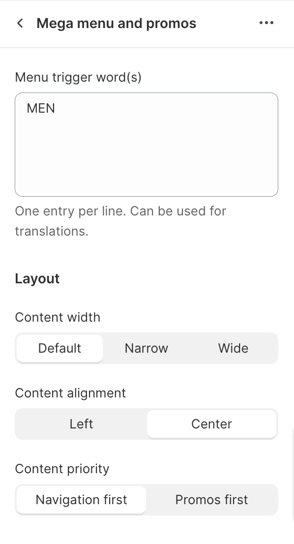
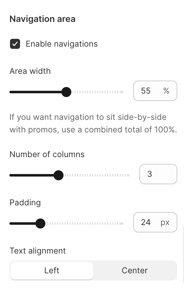
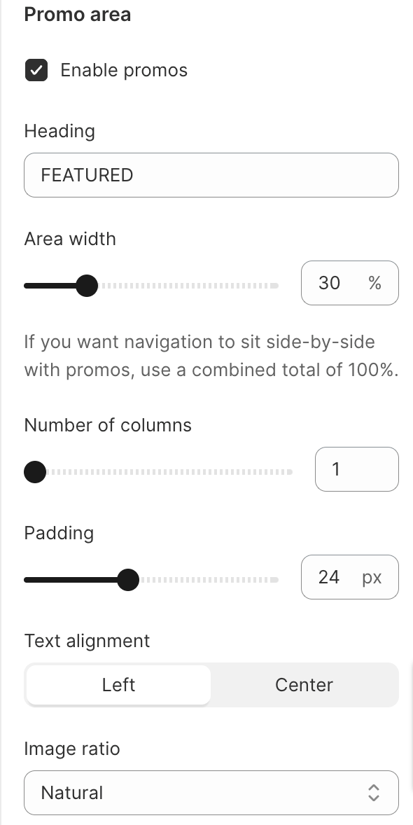
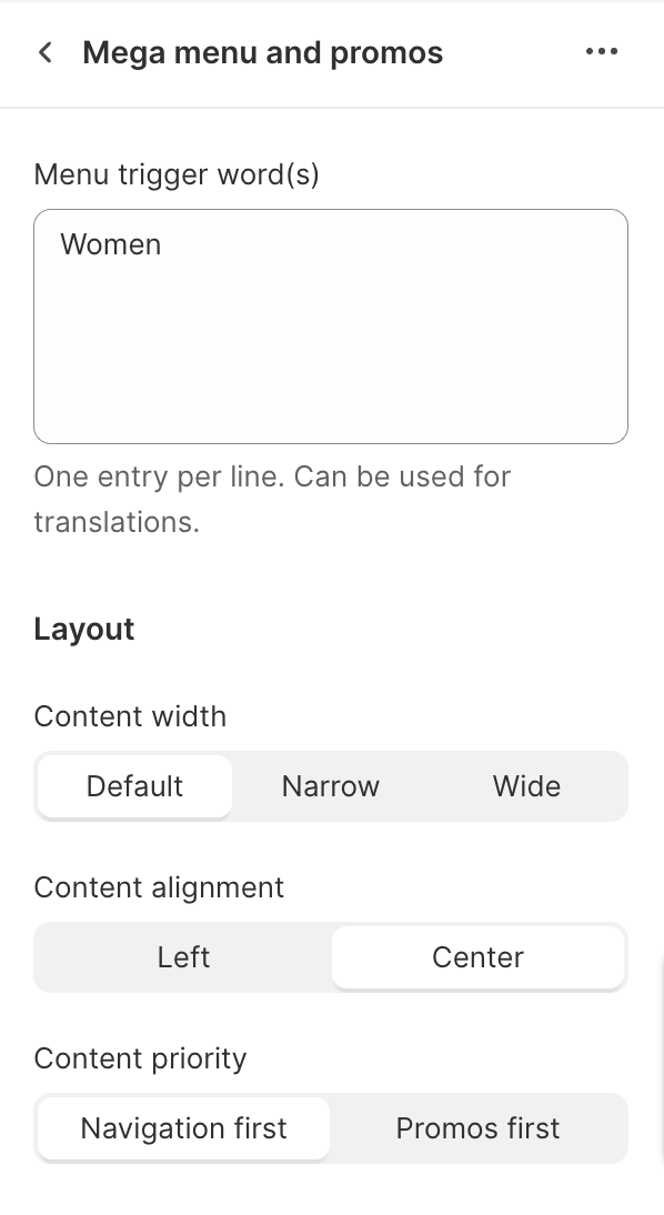
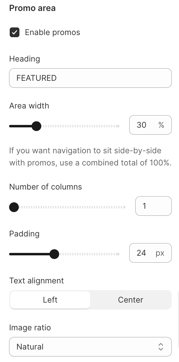
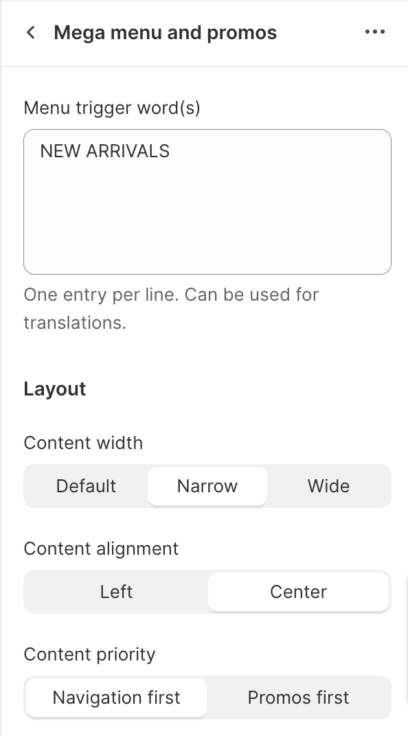
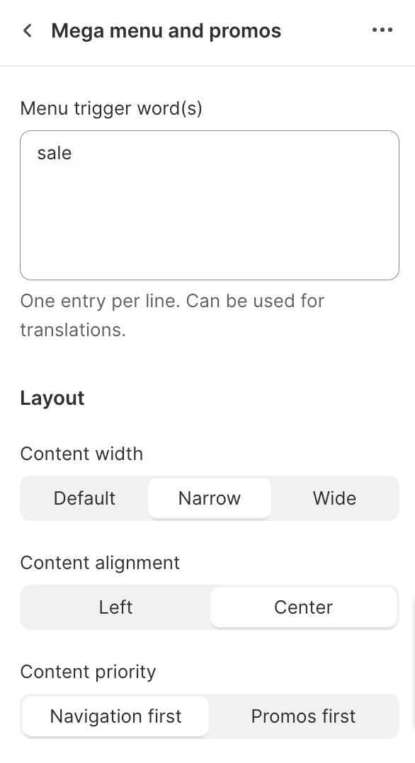
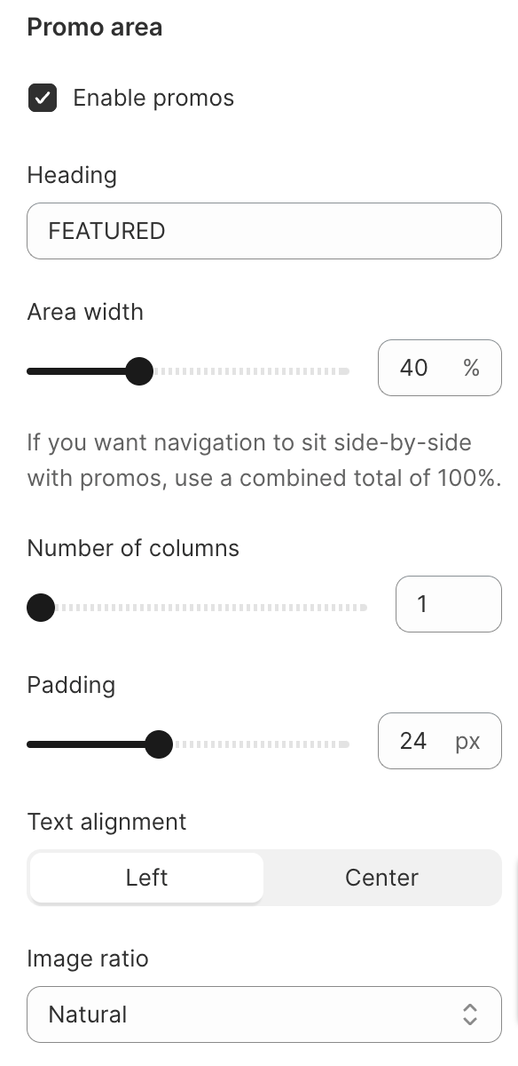
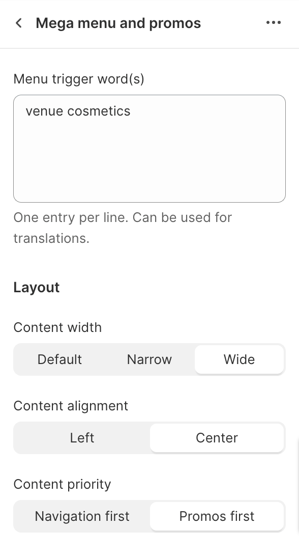
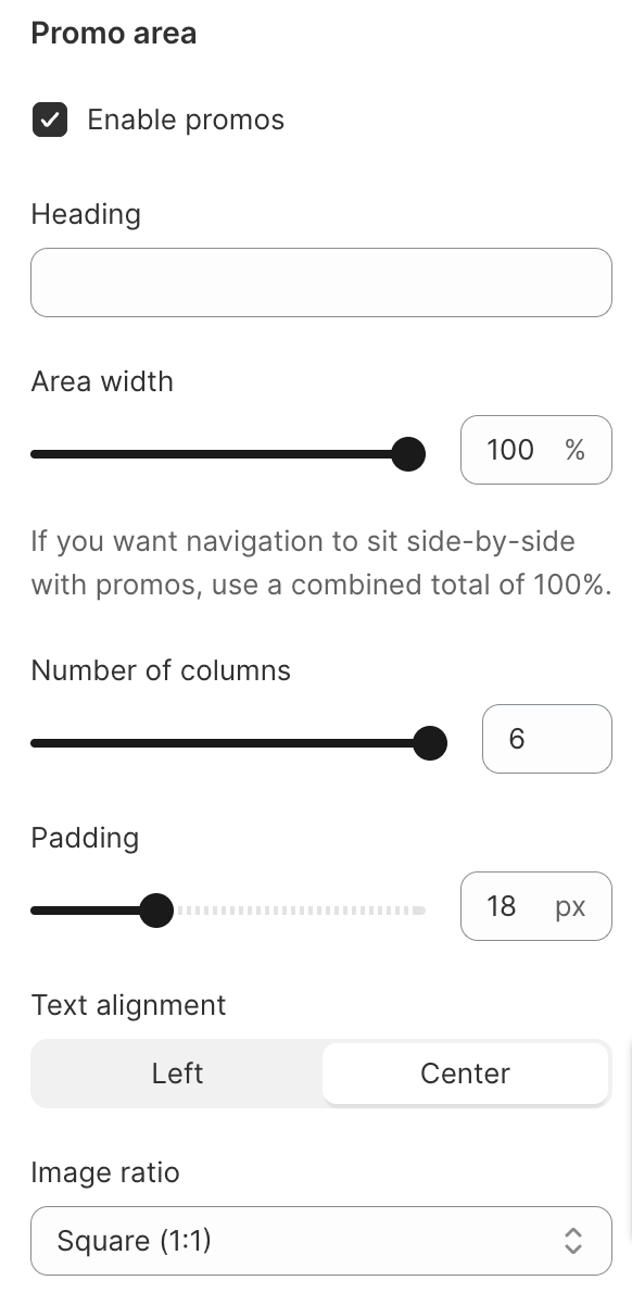
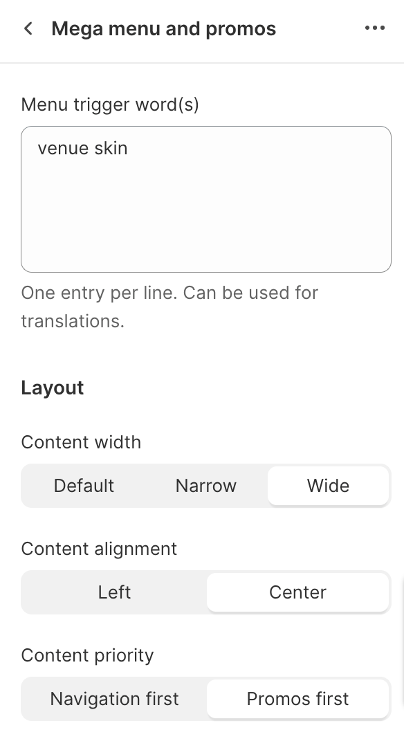
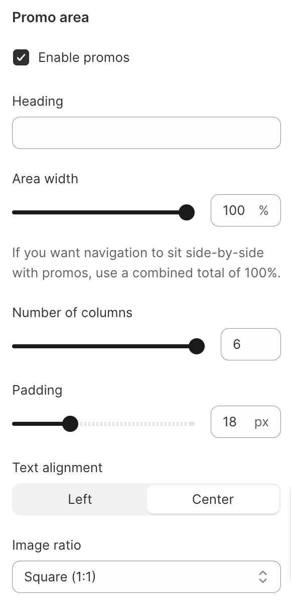
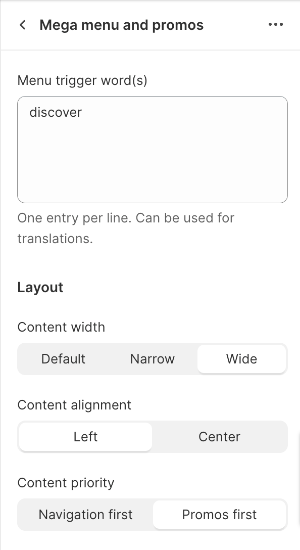
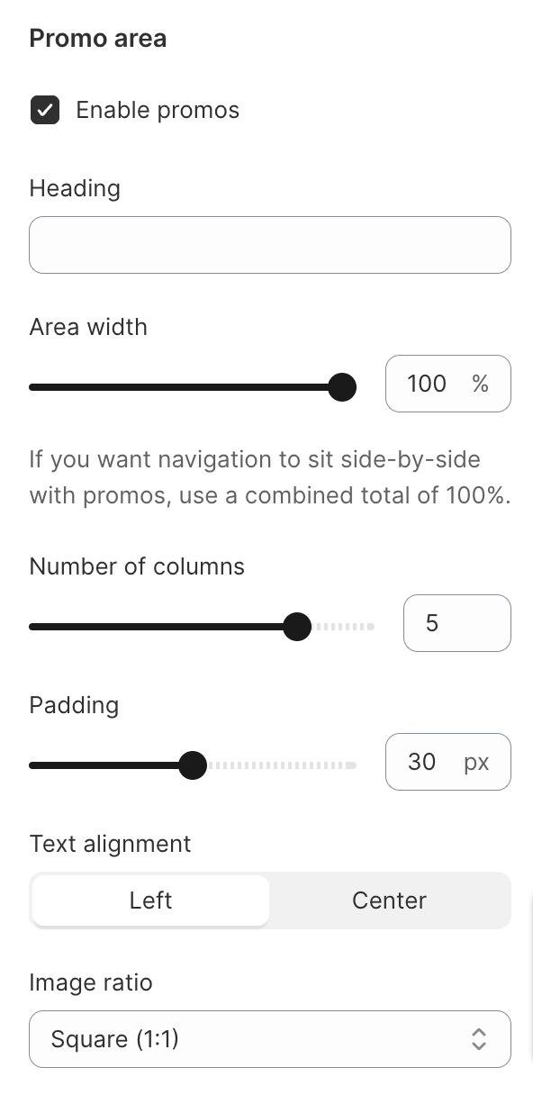
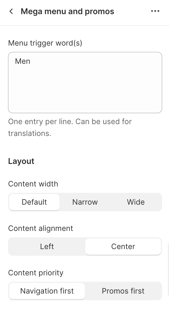
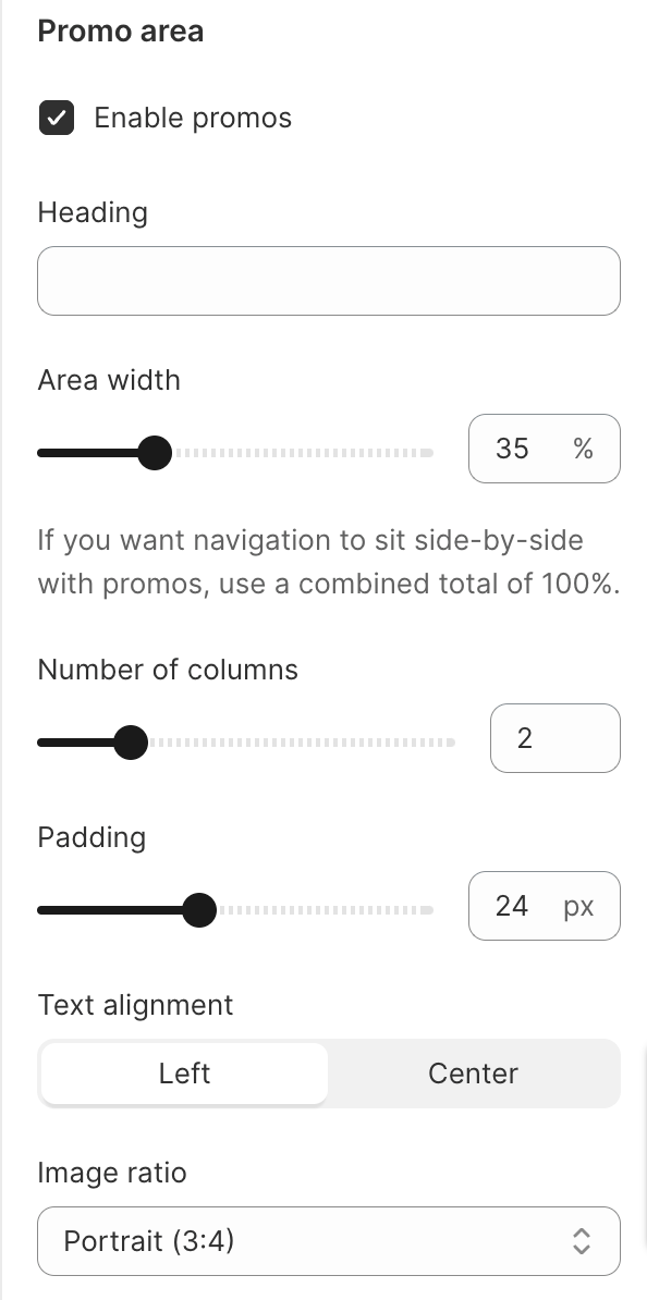
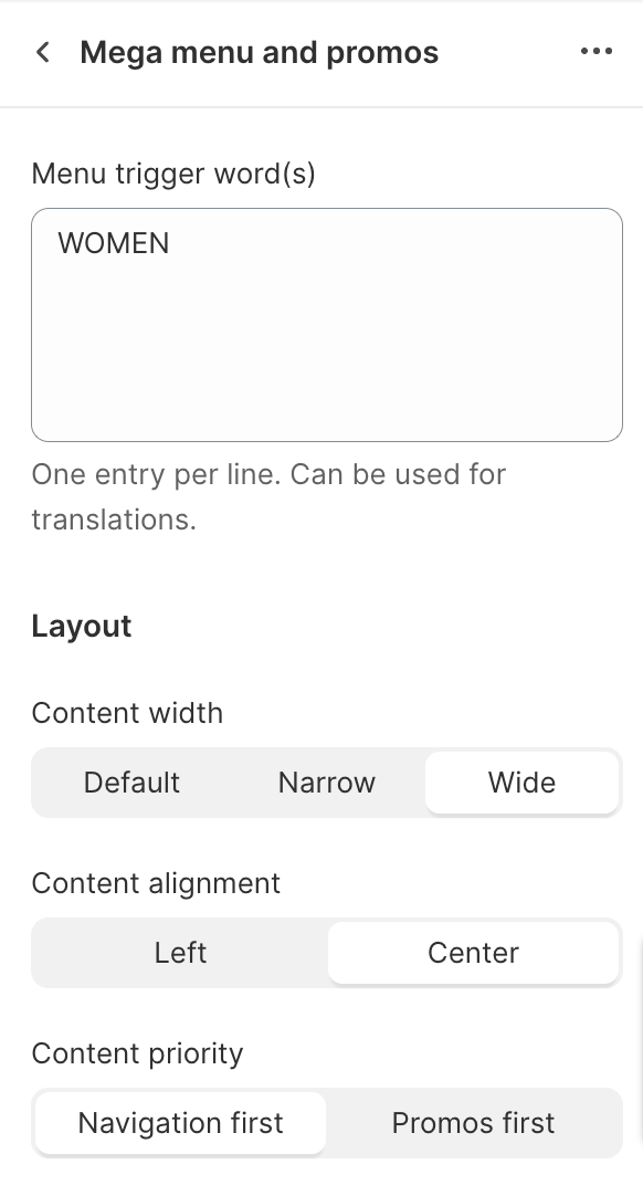
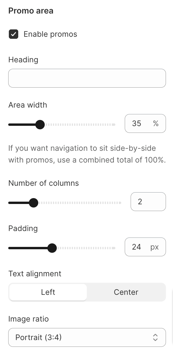
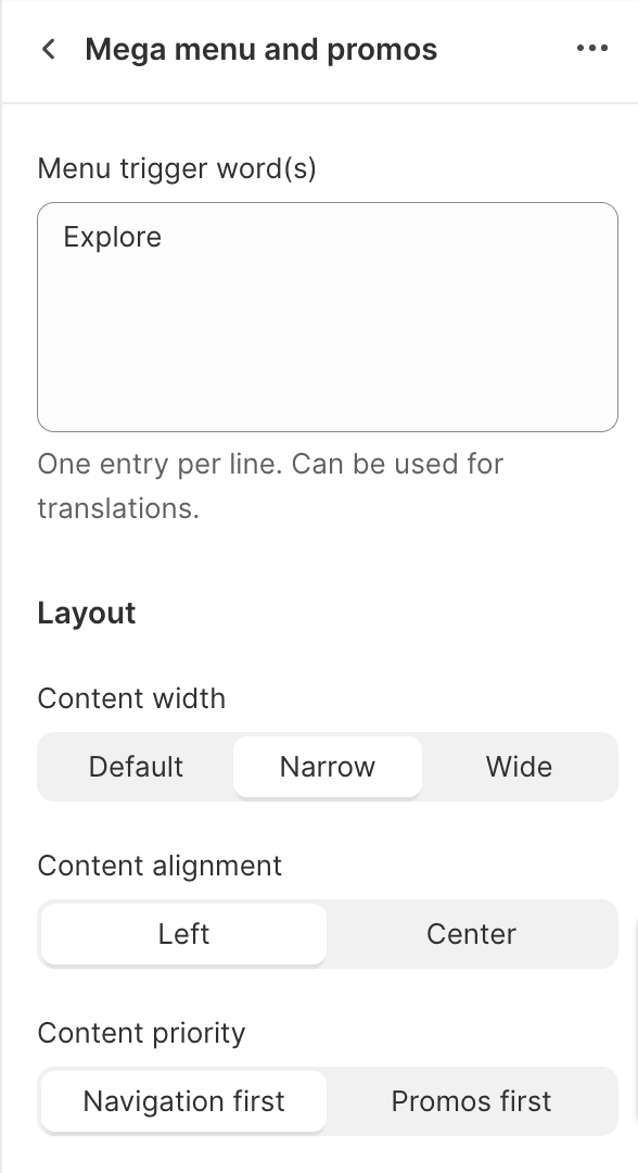
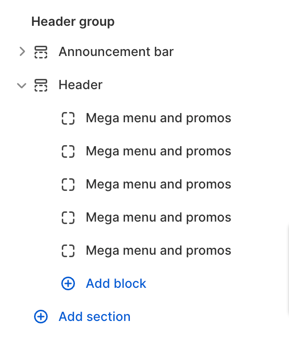
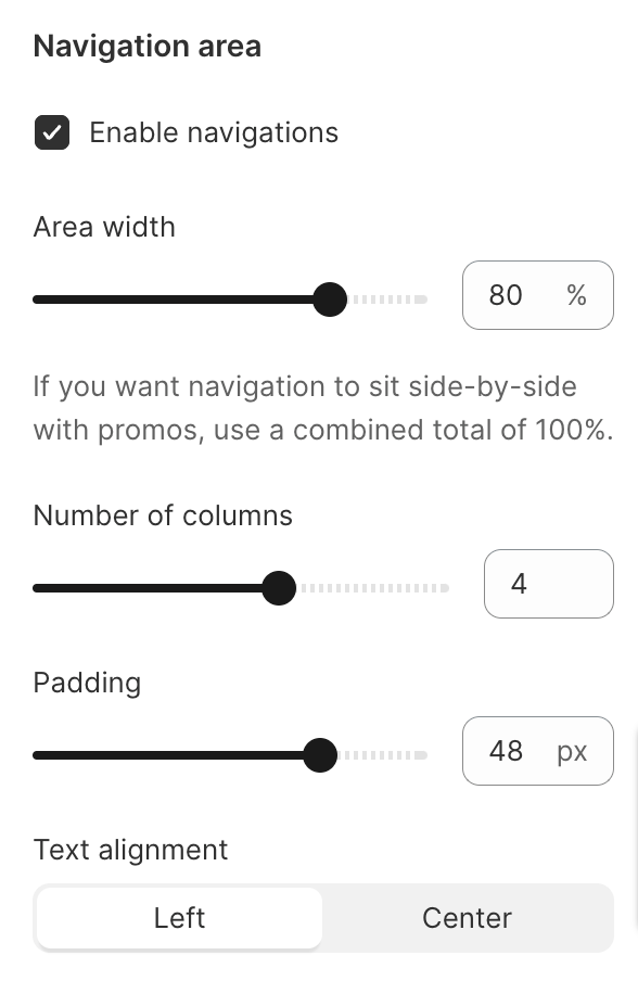
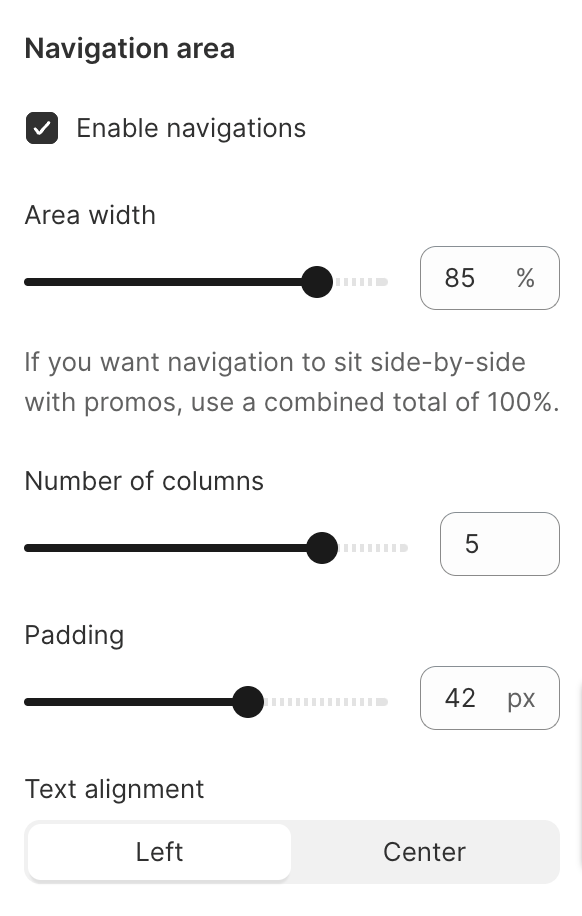
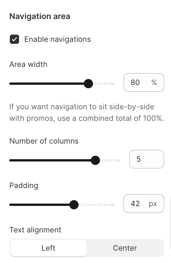
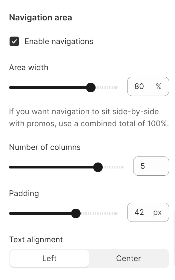
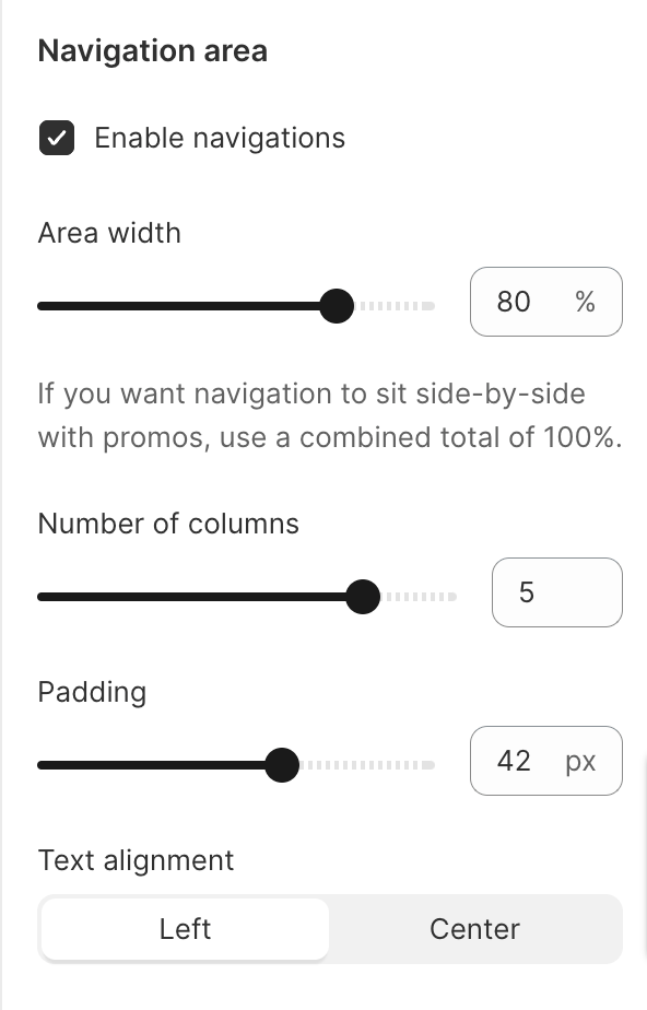
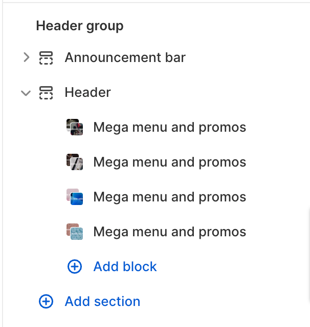
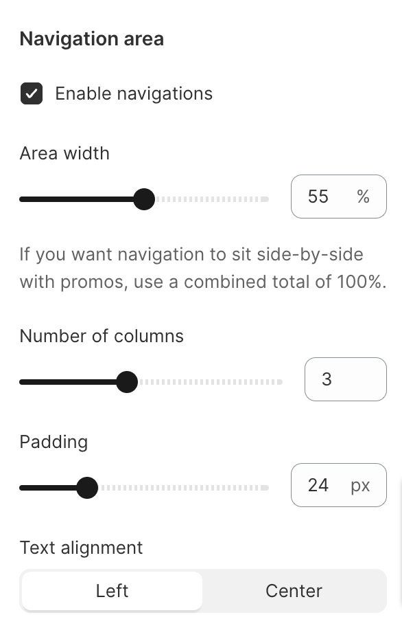
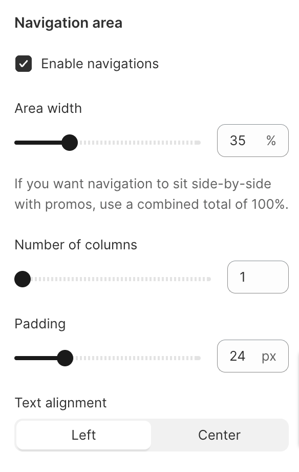
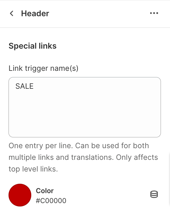
Below you can find the exact settings we used in the blog for each website:
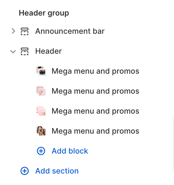
Nike settings:
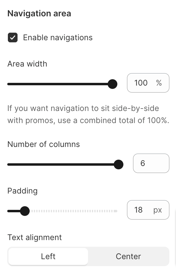
Allbirds settings:

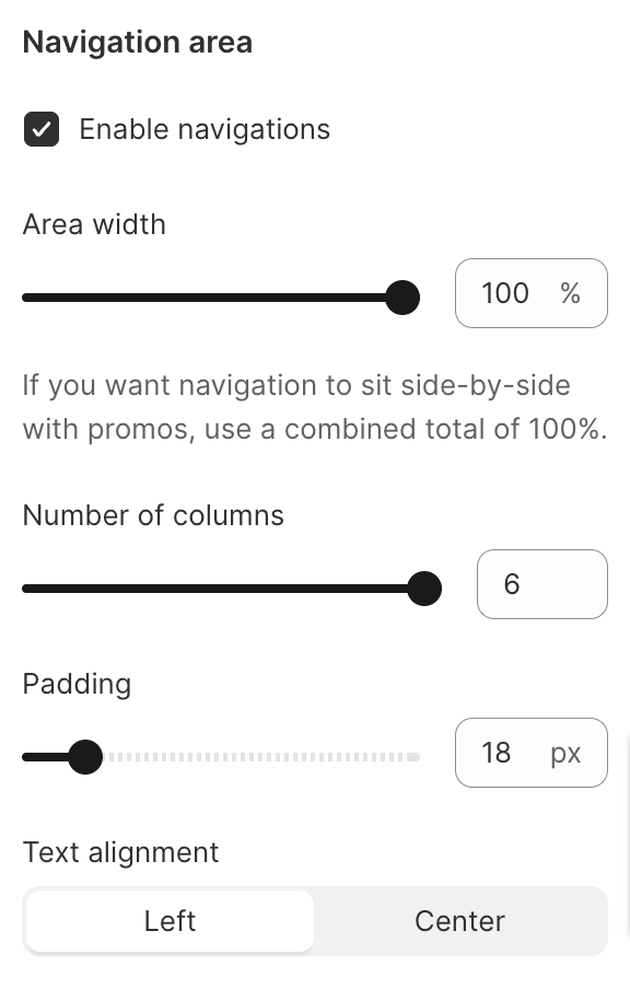
Kylie Cosmetics settings:
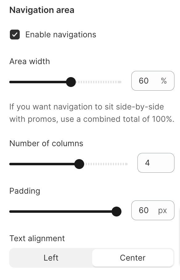
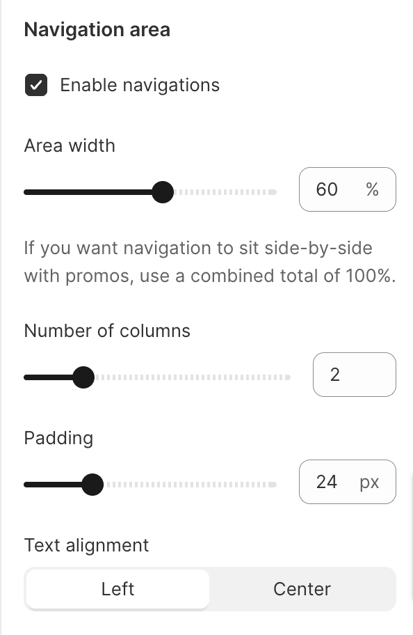
Tecovas settings:
