Meet Quick Shop - the fast lane to more sales
Venue Version 7.0 is here, it’s one of our most extensive updates yet. This version includes the launch of an exciting new feature called Quick Shop. A feature so fast that you’ll leave the competition in the dust!
Any online business owner knows, ecommerce design trends come and go. What’s hot one year might make you blush the next. However, year after year, there is one thing that you can be sure your customers will never get tired of and that’s a faster way to shop.
Check out our explainer video below:
The social media industry has led the way on speed for a long time, they identified that the big winners will be those who provide a service that flows and gets information to the user quickly and efficiently.
You only have to look at Amazon to see that this type of frictionless interaction with the online world has become the baseline expectation, especially among younger shoppers.
We caught up with our Dean Ricca-Smith, our Design Director, to get some insight into where this feature originated:
“The idea for the Quick Shop feature first began to form while I was watching my teenage daughter shopping for clothes on her laptop. I noticed that she wasn’t looking at any product pages but simply adding multiple items to her cart very quickly directly from a collection page, whenever possible.
When I asked her what she was doing she told me that this is how she always shops. She adds everything she is interested in to her cart and then goes back and edits it later. She may visit the product page or she may not. She uses the cart like a wish list.
This made me realise that perhaps the product page was becoming less important.”
Introducing Quick Shop for Venue
Quick Shop is a best-in-class ‘product quick buy’ feature, that gives your customers the tools they need to quickly view products, select variants and add them to their cart directly from the collection page or even check out, without the need to ever visit individual products pages.
With this, your customer’s visit becomes far more streamlined and the usual start/stop routine of loading full product pages is replaced with a flowing, fast-paced shopping experience.
Dynamic buy buttons sit neatly within the modal, giving your more eager customers the option to skip the cart page and go directly from Quick Shop to the checkout, in just one click.
Where available, button branding and logos are also included for each payment gateway, the visuals of a known and trusted payment gateway gives your customers that extra peace of mind when visiting your store and making their purchases.
We’ve also kept customers who want to buy multiple products in mind, who are we to get in the way of a shopping spree after all?
We have built in an option to suppress the cart page, relieving your customers from seeing it every single time they decide to add a product.
With this option enabled, Quick Shop can be used to browse and add products without interruption, customers only need to visit the cart page to edit their selection and move into the checkout when they are ready.
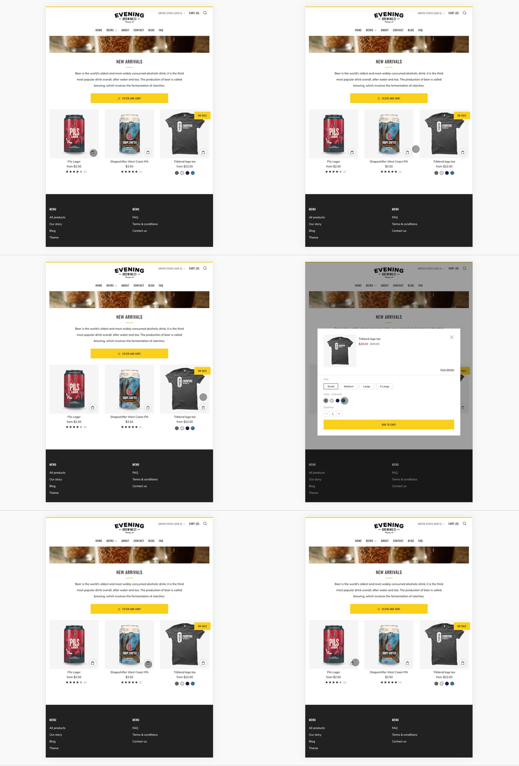
The screengrabs below show how Quick Shop works on desktop/large screen devices :
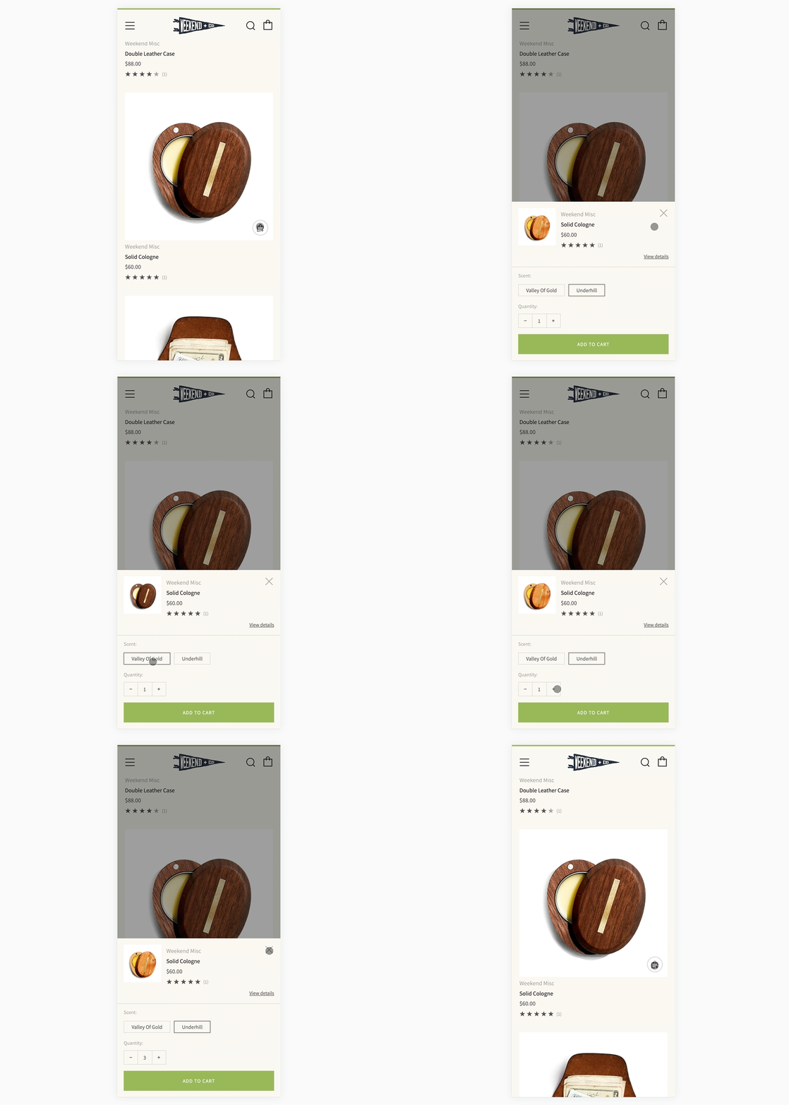
As touch devices don’t have a hover interaction, the mobile design differs from the desktop version. On mobile and tablet, the Quick Shop modal is activated with an icon, visible on the bottom right-hand side of the product image.
Check out the mobile screengrabs below:
Here is how it will look on tablet devices:
We’ve also equipped the feature with all the settings you need to make Quick Shop work for your business, including:
Modal style (modal or simple button)
Button style
Dynamic buttons on/off
Inventory and tax notices
Suppressing the cart
We’ve also added extra design flexibility around the product grid giving you more control over aspects like swatch color and shape, labels and fonts. More on this later.
What makes Quick Shop stand out?
There are many quick view style apps and custom developments out there, however, instead of providing an effective tool for customers to use, they often end up being a bit…ok, very…clunky and slow.
On top of this, they are not developed for a specific theme or website, instead, they usually come in the form of a ‘one size fits all’ add-on app, so rather than being a sleek addition to the website design, the feature sticks out, becoming an eyesore on the site - a square peg in a round hole.
Quick Shop on the other hand is developed natively as part of the wider Venue theme, so it slots in like a missing jigsaw piece, flowing with the rest of the website from a functional and visual perspective.
Here’s more from Dean, our Design Director:
“Of course we’ve all seen quick ‘view’ features before but the challenge was how could we make the shopping experience even quicker and more efficient. Adding a product to a cart from a collection page is very easy when there are no product variants such as size or colour.
However, when there are product variants in play most themes will redirect the user to the product page from a collection page button. From our new Quick Shop modal you simply select your size and colour and add to the cart instantly.
This reduces clicks needed to buy a product and keeps the user in the ‘buying flow’ without taking them to a new page.”
‘Buying flow’ is the key phrase here.
Each extra click that your customers have to make separates them further from the end goal, buying a product. The development work behind Quick Shop was focused on making browsing and purchasing a breeze for your customer.
Other Venue 7.0 highlights
Along with Quick Shop, we’ve made other significant improvements, offering you more flexibility over the design of your product grid and store as a whole.
Here’s some of the more impactful ones:
Typography: We saw the need for more flexibility and granular control when it comes to fonts. Choosing a font style, size and case is a big deal and plays a huge role in the design of your website.
Swatches: You now have control over the size and shape of your color swatches.
Italian translations: For our Italian users and merchants ready to expand, Italian language translations are now available.
Of course, we’ve made a whole host of smaller improvements too. We’ve worked hard to ensure Venue and your online store stay at the top of the pack. We’re excited for you to use it!
For a full breakdown, you can view our Venue 7.0 release notes by clicking here.
Ready for Quick Shop but not yet using Venue? Click the button below to visit the Venue theme page in the Shopify theme store. You can also use this link to install the latest version if you already use Venue on your store.


